Quickstart
In this short tutorial, we show a typical workflow with bootplot. Before continuing, make sure you installed bootplot as shown in the Installation section.
In this example, we will work with with a toy regression dataset. We wish to fit a model to the dataset and estimate its uncertainty, but we don’t want to perform any estimation ourselves. Fortunately, we only need know how to make basic plots and bootplot will handle everything else in a black-box manner.
Note that bootplot can help in a wide range of analyses such as regression, classification, clustering and others. For more examples, check the examples section.
Loading our data
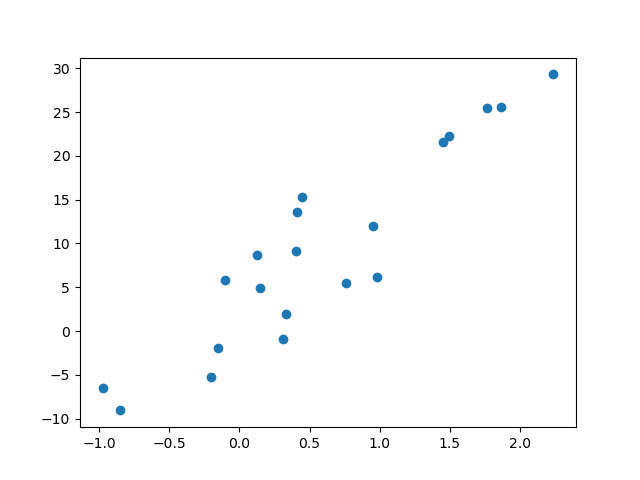
We first have to load our dataset. We can work with any dataset, but we will focus on a simple toy regression dataset for this example. Our dataset contains 20 samples with a single feature.
from sklearn.datasets import make_regression
x, y = make_regression(n_samples=20, n_features=1, random_state=0, noise=5.0)
We plot the dataset to see what we’re working with:
import matplotlib.pyplot as plt
plt.scatter(x, y)
plt.show()
Fitting a regression line
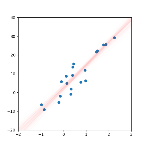
It clearly looks like the data can be described with a regression line. We will import a linear regression object, use it to fit the data and plot the data with the regression line.
from sklearn.linear_model import LinearRegression
import numpy as np

# Create and fit the linear regression object
lr = LinearRegression()
lr.fit(x, y)

# Create some test data and create the regression plot
test_x = np.linspace(-2, 3).reshape(-1, 1)
fig, ax = plt.subplots()
ax.scatter(x, y)
ax.plot(test_x, lr.predict(test_x), c='r')

# Define the plot limits
ax.set_xlim(-2, 3)
ax.set_ylim(-20, 40)

plt.show()

Generating bootstrapped plots
We now have a regression plot.
However, we still want to estimate the uncertainty in our model and we don’t wish to do any explicit work ourselves.
Thankfully, bootplot will help us out.
We simply move the plotting code into a function and pass this function to bootplot.
from bootplot import bootplot

def plot_regression(data_subset, data_full, ax):
    lr = LinearRegression()
    lr.fit(data_subset[:, 0].reshape(-1, 1), data_subset[:, 1])
    test_x = np.linspace(-2, 3).reshape(-1, 1)
    ax.scatter(data_full[:, 0], data_full[:, 1])
    ax.plot(test_x, lr.predict(test_x), c='r')
    ax.set_xlim(-2, 3)
    ax.set_ylim(-20, 40)

bootplot(
    plot_regression,
    data=np.column_stack([x, y]),
    output_image_path='quickstart_regression.png',
    output_animation_path='quickstart_regression.gif'
)
The result is an image and an animation that both display regression line uncertainty:

Note
It is often essential to manually specify axis limits. This is to ensure all bootstrapped plots cover the same area and hence use the same axis ticks. If axis limits are not provided, some image elements such as ticks may appear blurry depending on the plotting function.